Briefcase

Briefcase’s dashboard was confusing and conversion-heavy too early. I redesigned the experience to reduce drop-off, clarify navigation, and give users confidence from the very first screen. The result was higher portal creation, reduced bounce, and an increase in paid conversions.

Tasks

Process audit
User research
Dashboard redesign

Deliverables

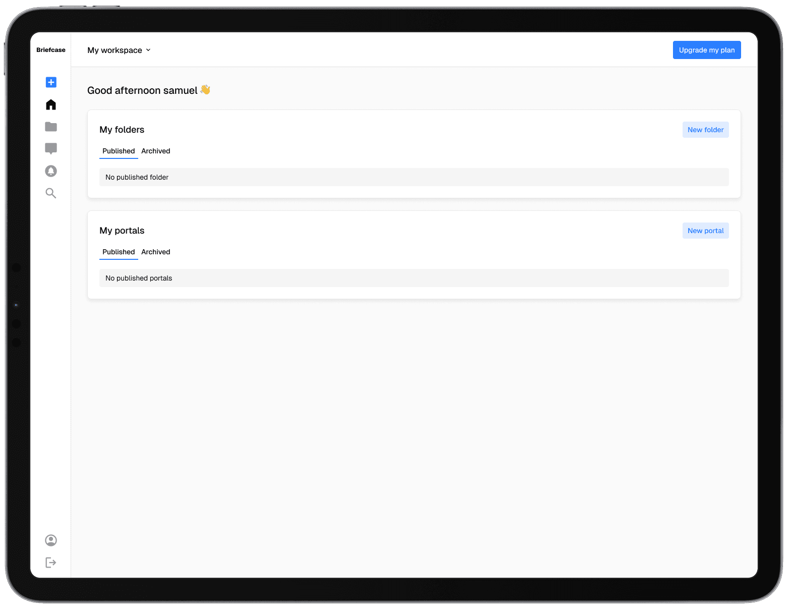
Simplified navigation
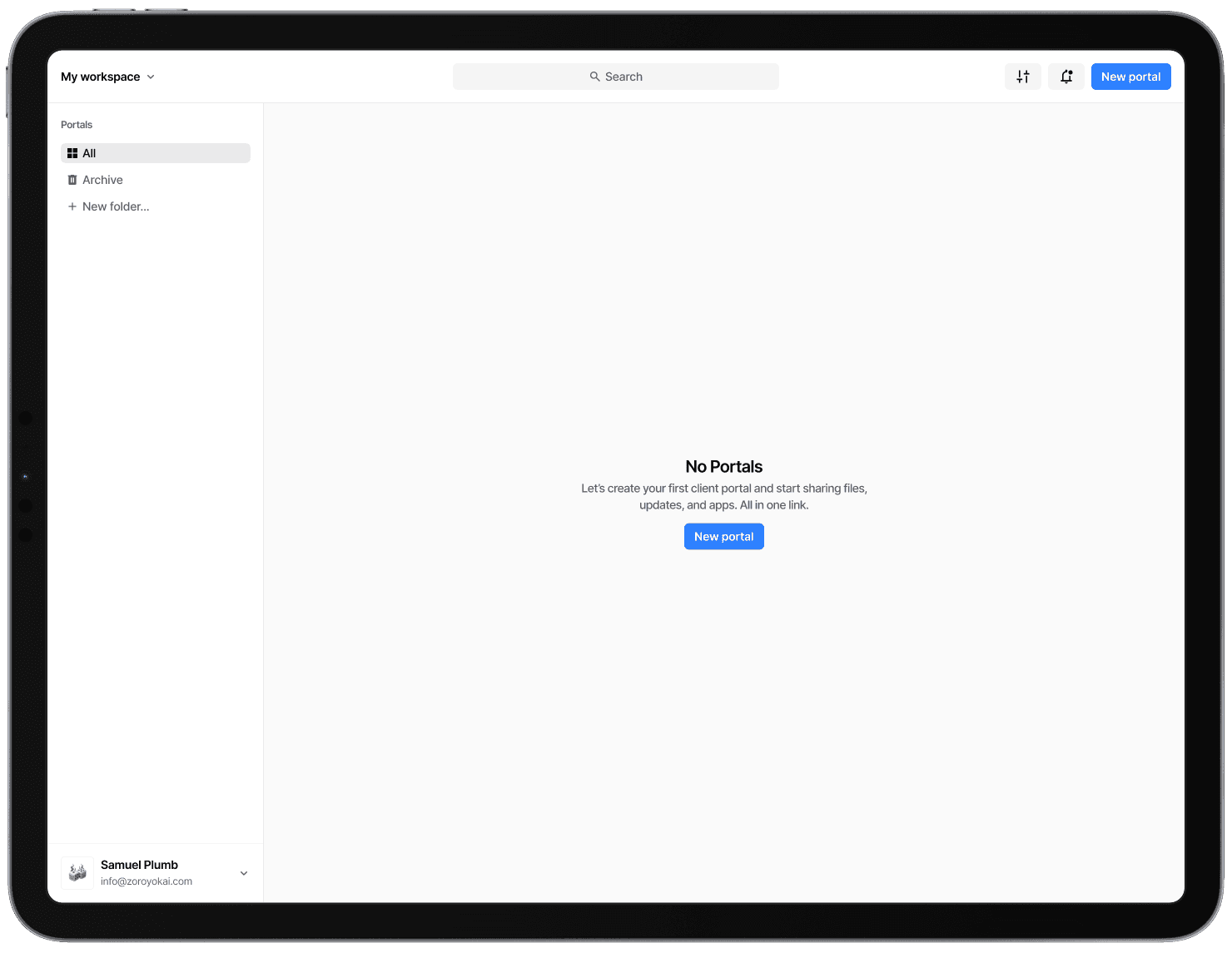
Clear empty state

Reduce bounce

Team

Myself
Founder's

The Problem

Briefcase's dashboard, the first screen users see after signup, was failing to convert. Built on a WordPress theme, the design was not aligned to the product and uninspiring. Users bounced immediately or stalled, unable to find the right actions.

Sidebar icons had no labels, creating ambiguity and friction
No expand/collapse, forcing hover exploration
High cognitive load: users had to guess what actions were possible
Inverted priorities: the main CTA was Upgrade Plan instead of Create Portal
Lifeless dashboard containers with little guidance or nudging
Theme-based UI that didn’t feel like a product

Discovery

I audited the interface and analysed user behaviour to pinpoint where confusion led to abandonment. I also mapped the flow for first-time users and noted mismatches between intent and design.

Users didn’t understand the sidebar
Nothing felt actionable or obvious
First-time users were confronted with a payment CTA
The “empty state” of the dashboard was unhelpful, leaving new users lost
Lack of hierarchy and structure reduced trust and confidence

Strategy

The goal was to reduce friction, clarify intent, and drive first action. I focused on restructuring navigation, simplifying the empty state, and reordering the hierarchy of calls-to-action.

Reframe empty state to nudge immediate portal creation
Inspired hierarchy from trusted tools like Slack, Notion, Linear

The Solution

Every user insight translated directly into a feature. The result was a mobile-first tool built for clarity, speed, and trust.

Stripped sidebar to just folders (All, Archive, Add New)
Anchored account settings and help at the bottom
Moved Add New Portal to a clear, dominant CTA in the header
Reframed empty state with guidance, description, and single call-to-action
Shifted hierarchy from upgrade-first to action-first
New mental model: Sidebar = folders, Header = actions, Dashboard = portals

Outcomes

The redesign shifted the product from theme-based confusion to action-oriented clarity.

Drop-off and bounce rates decreased
More users created their first portal immediately after signup
Returning users who deleted all portals converted again thanks to the new empty state
Pricing changes aligned with per-portal models, driving upsells
Users gained trust and confidence in the product from their very first interaction

To protect the identity of the actual client, this case study uses a faux brand, Briefcase. While the flows and design challenges are the same, the product has been reframed.